Boundary by Behind Design
Boundary by Behind Design reconsiders the vacation residence as a place of deliberate lightness.
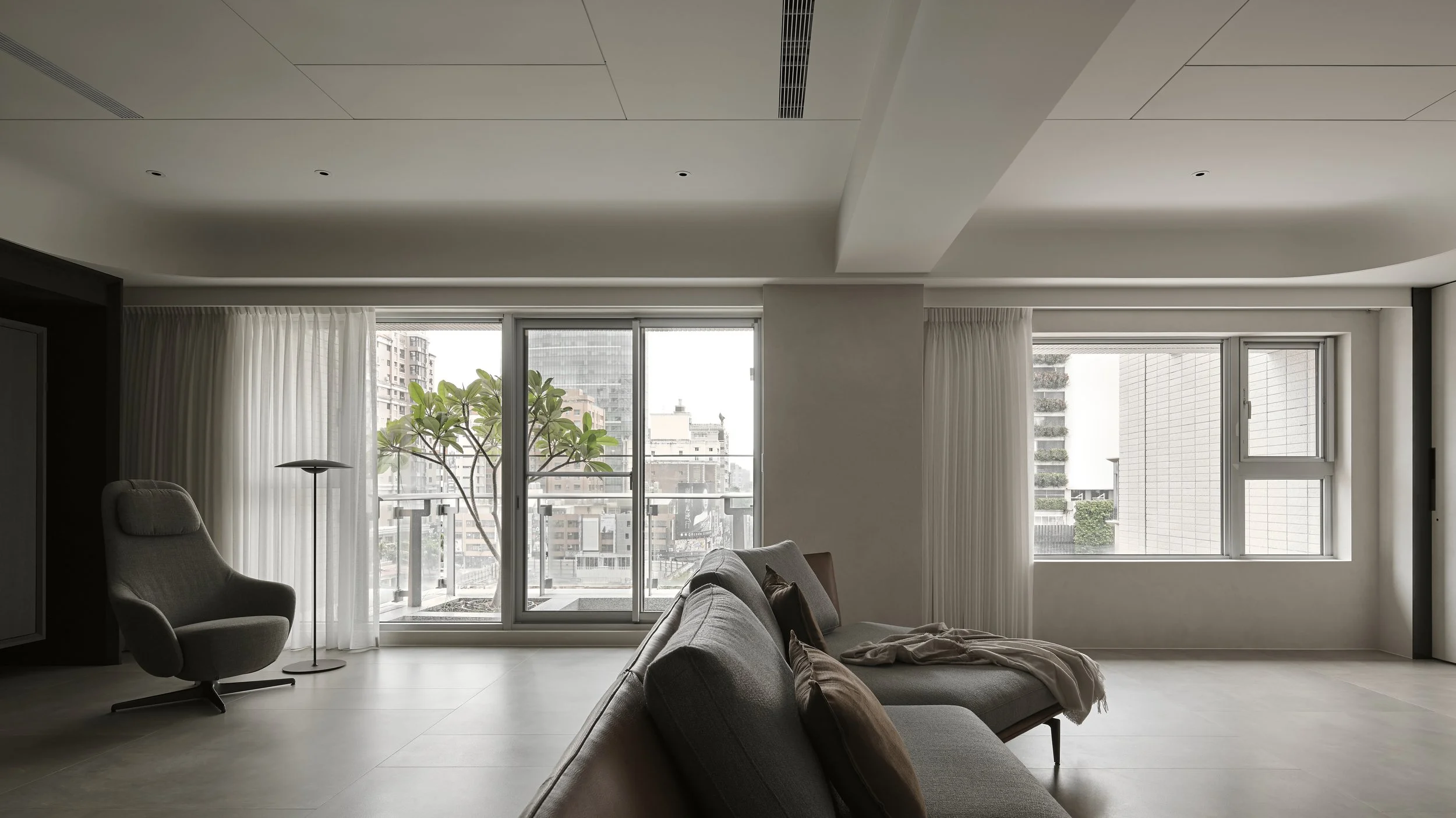
Used only intermittently when the homeowner visits Taichung, the home is shaped to feel open on arrival, calm in occupation and easy to leave behind. The design centres on extending spatial lines as far as possible, preserving a long read through the interior so that comfort is felt less through enclosure than through release.
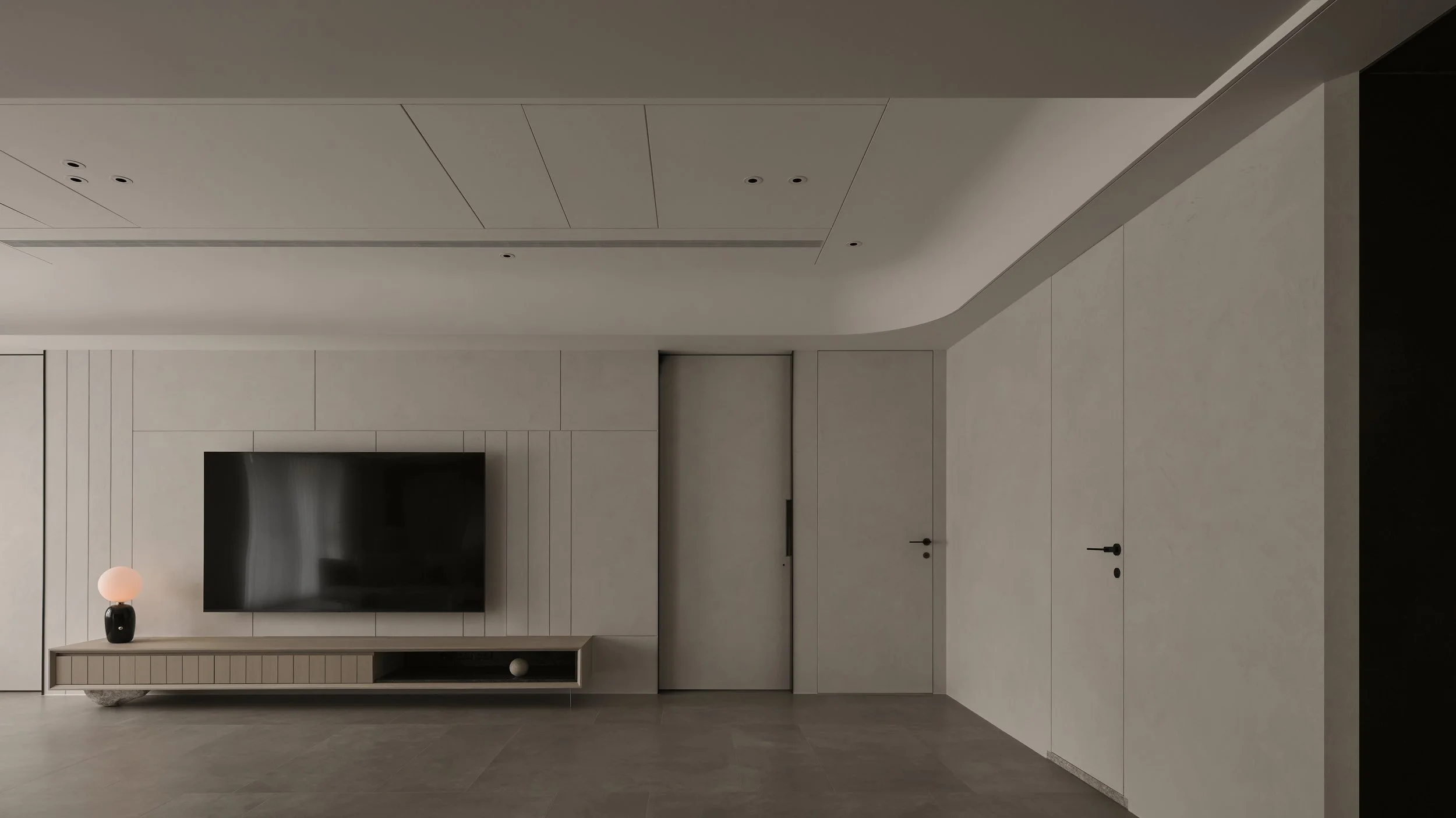
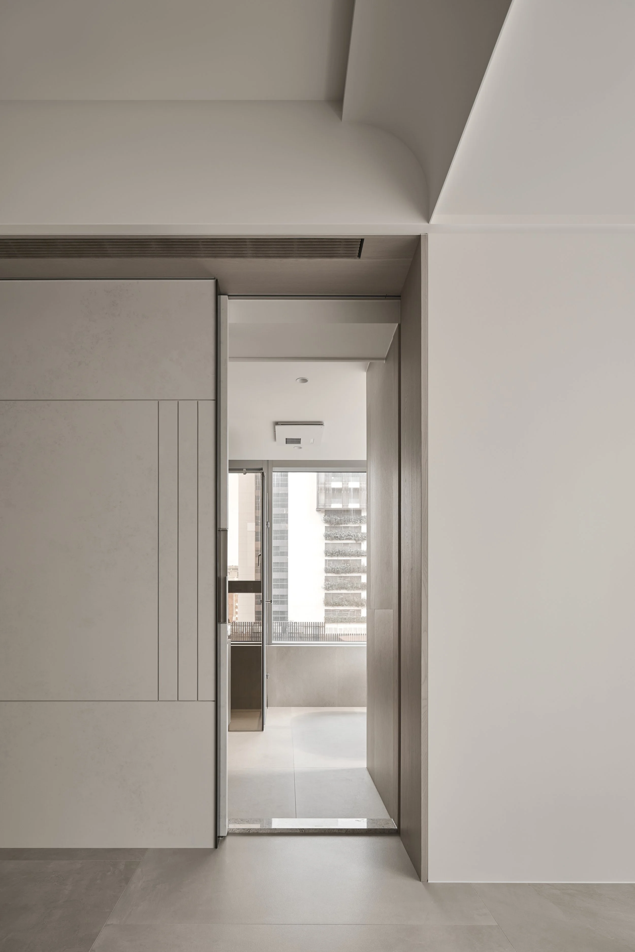
Rather than asserting permanence through full-height cabinetry and dense built-ins, the project resists the language of hard renovation. Storage is reduced, lifted and thinned. Elements that would typically become architectural fixtures are handled as furniture-like insertions and open frameworks, keeping the original envelope present and proportionate. In doing so, the apartment’s existing scale remains intact, while light and movement travel with little interruption.
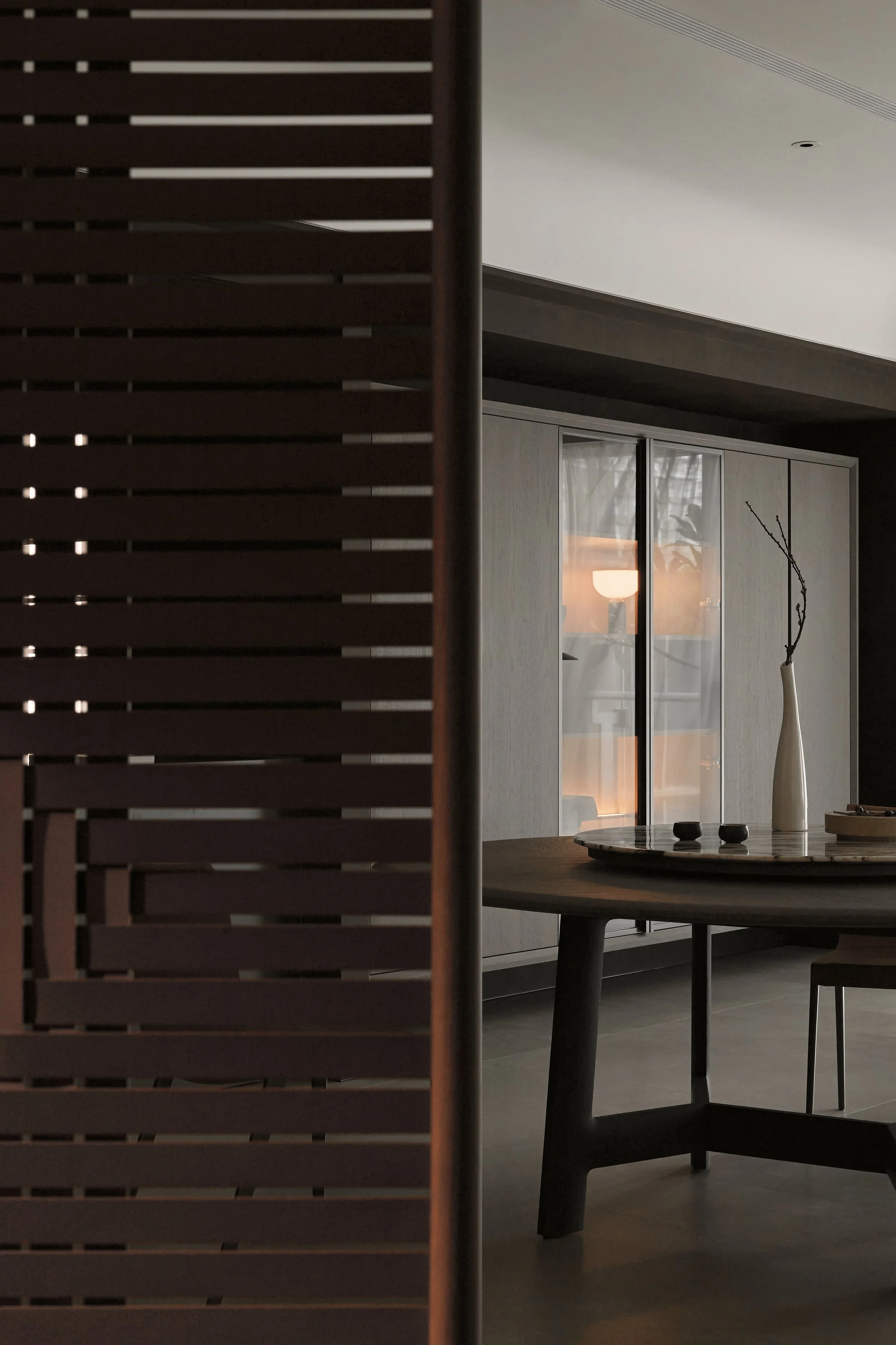
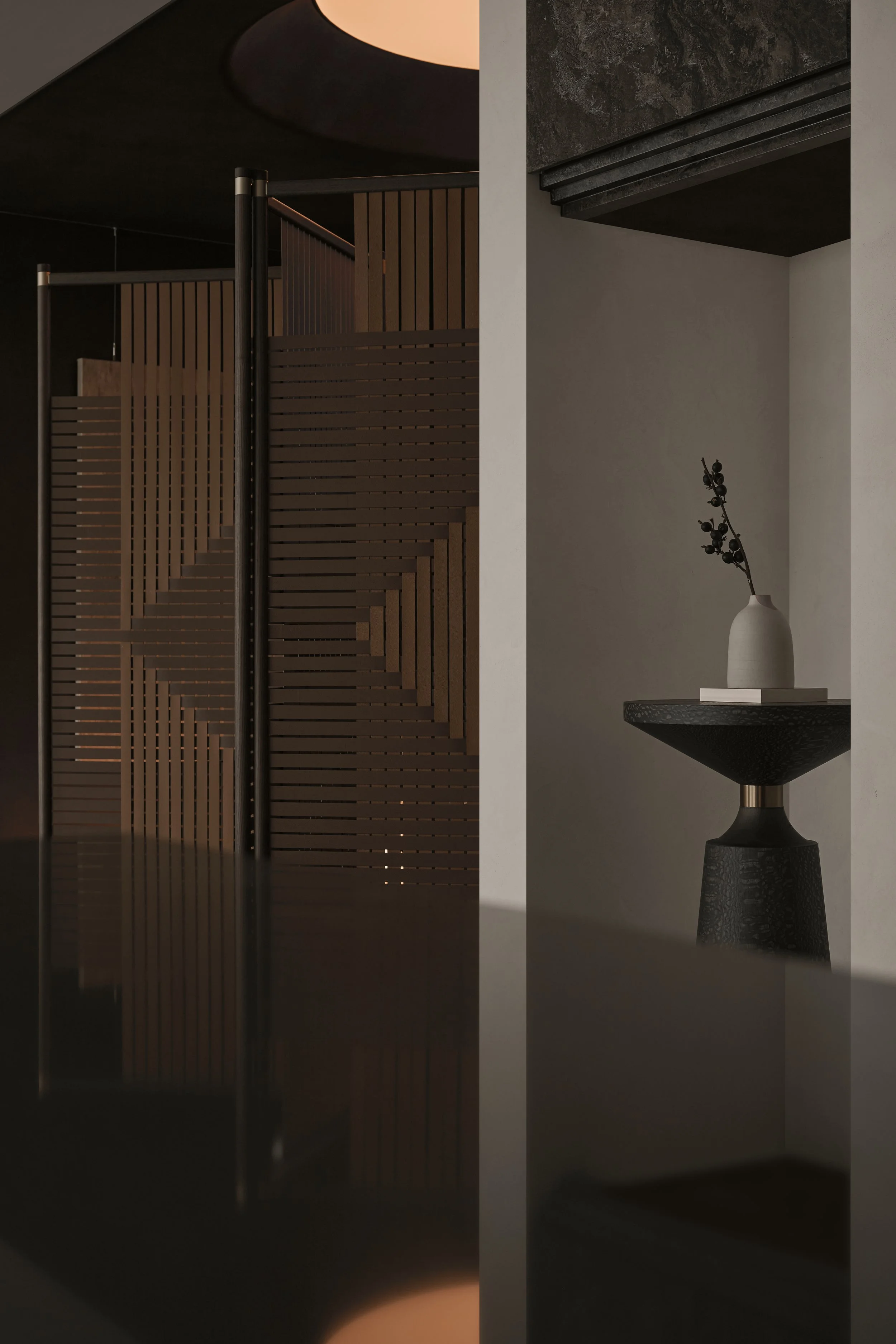
At the threshold, privacy is achieved without closing down the plan. A movable screen sets the foyer apart from the living area and redirects the approach toward the cloakroom, responding to the homeowner’s preference to avoid direct views inward from the entry. The gesture is functional but also spatially generous, defining a clear edge while keeping air and visibility in play.
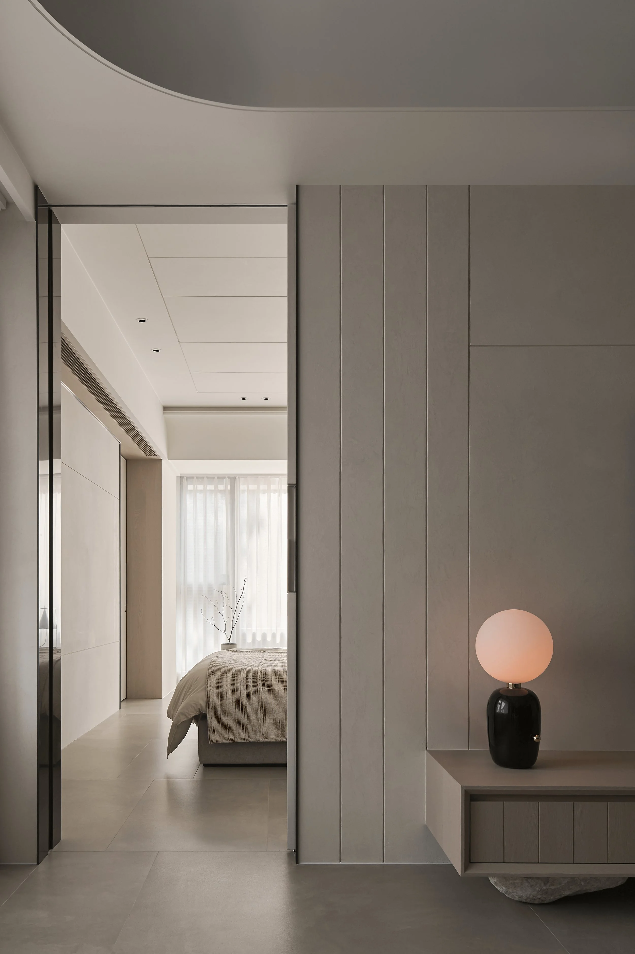
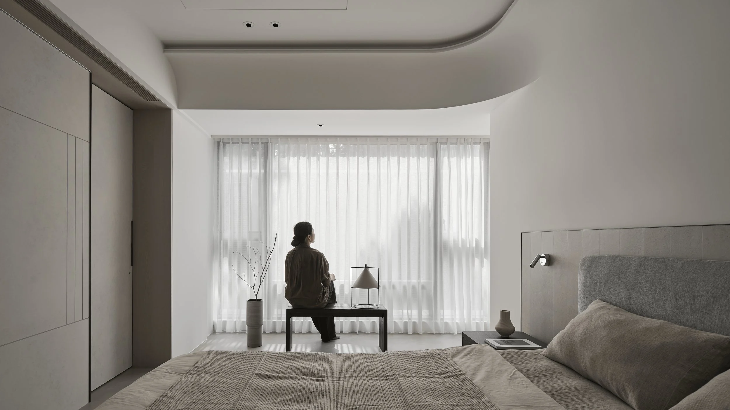
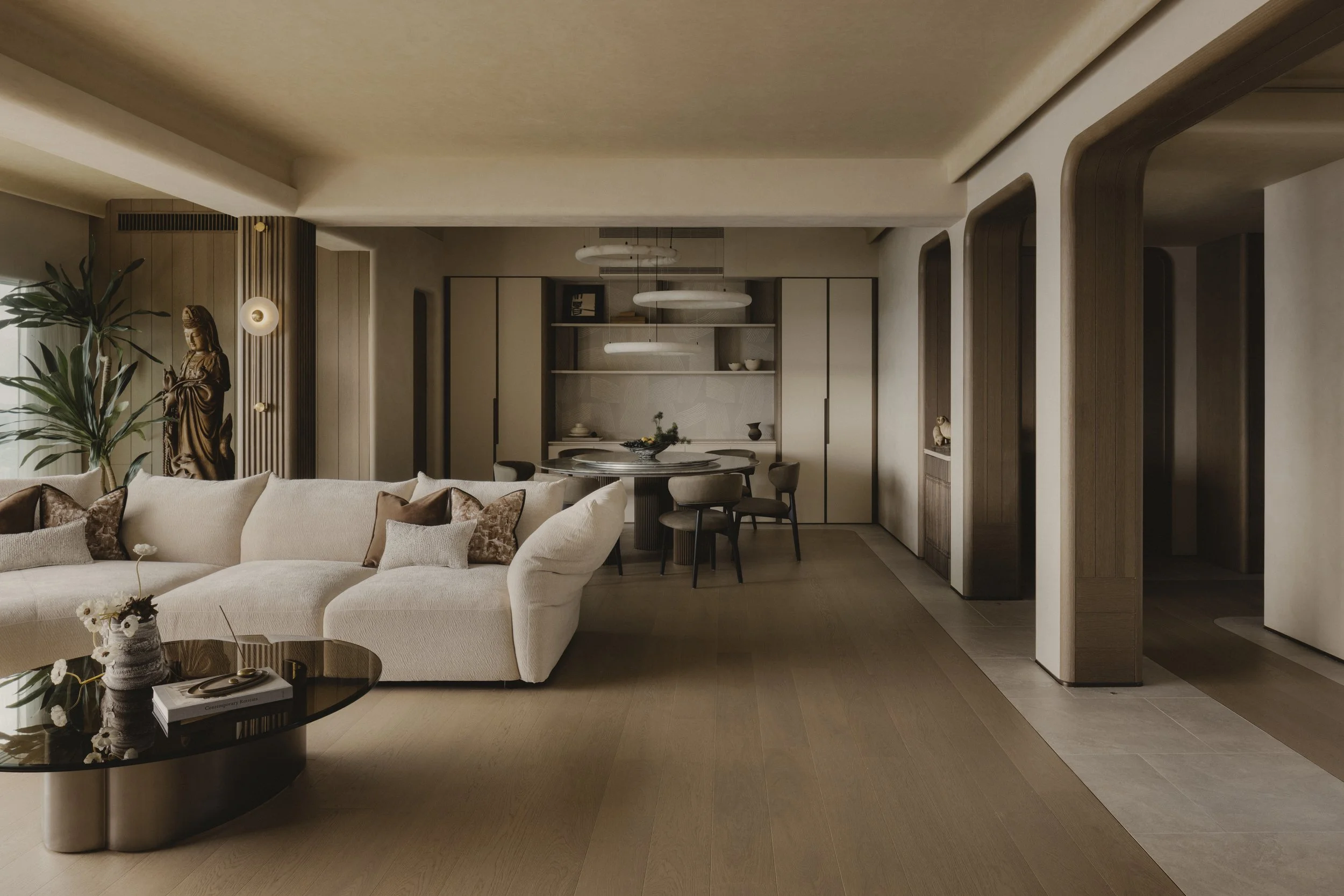
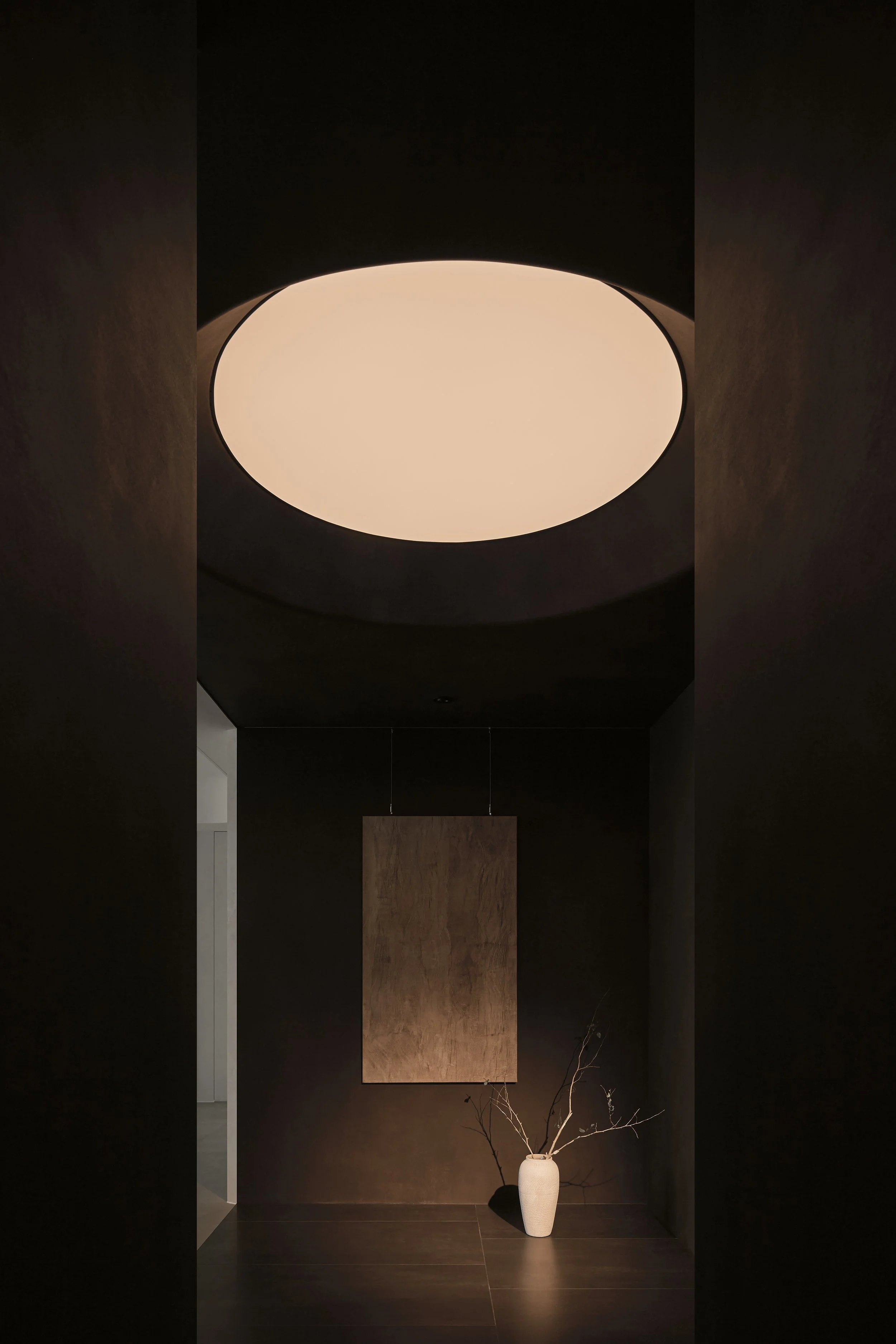
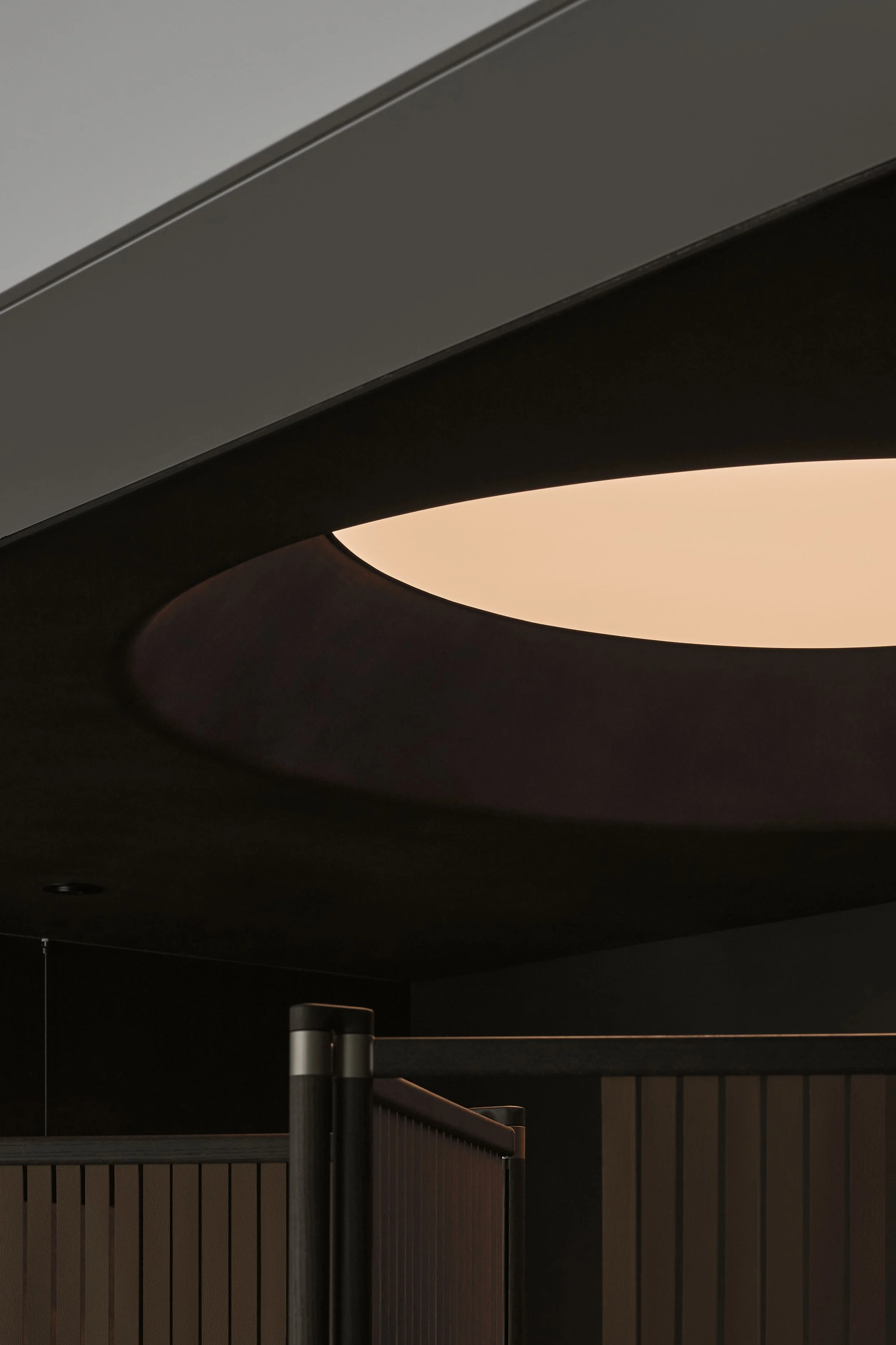
Beyond the entry, a restrained vaulted ceiling becomes the project’s primary organiser. Its simple curve traces the main axis through the home, drawing attention forward and reinforcing the continuity of the plan. This overhead line gives the interior a quiet sense of direction, allowing the eye to follow form rather than fixtures.
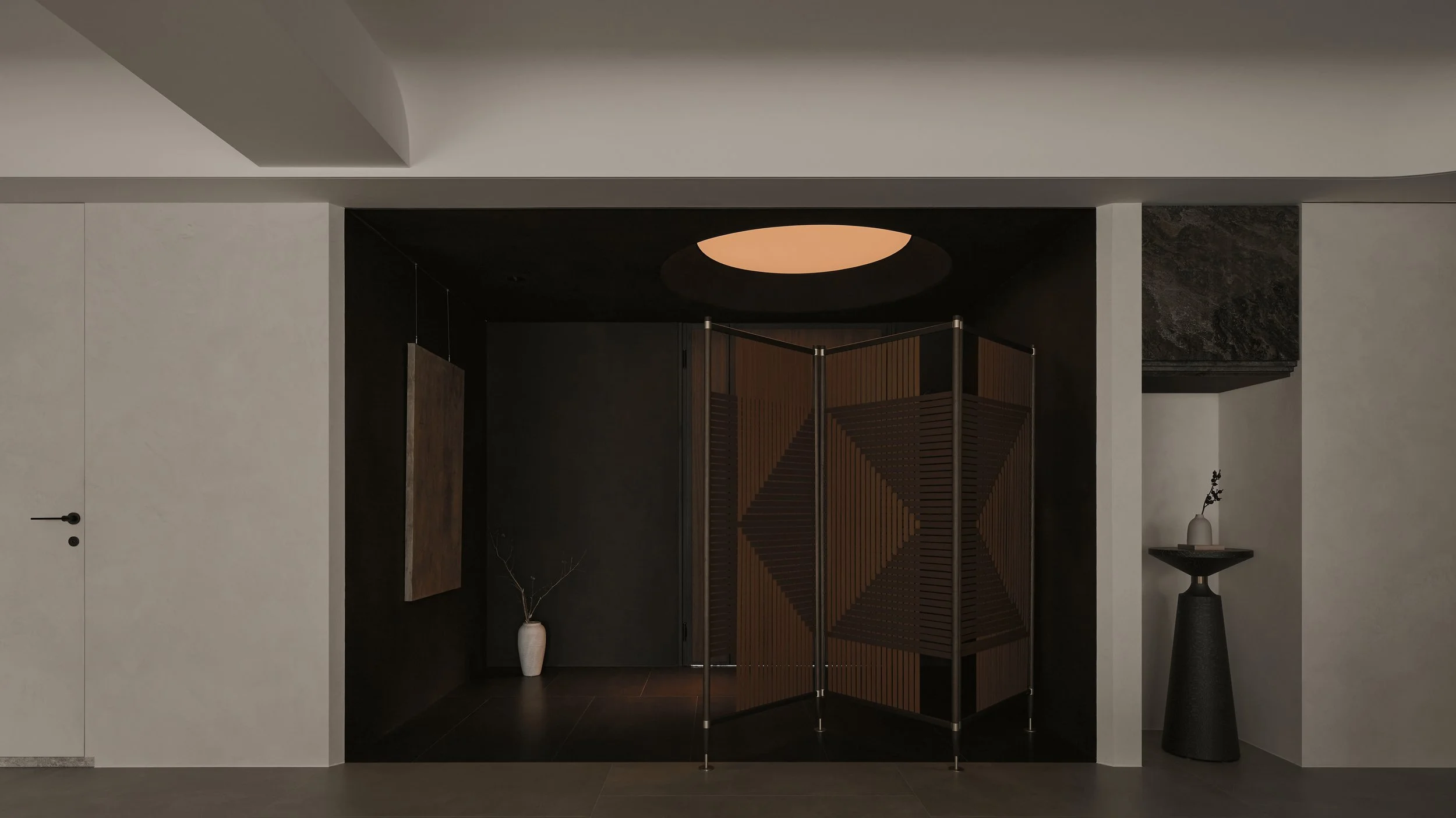
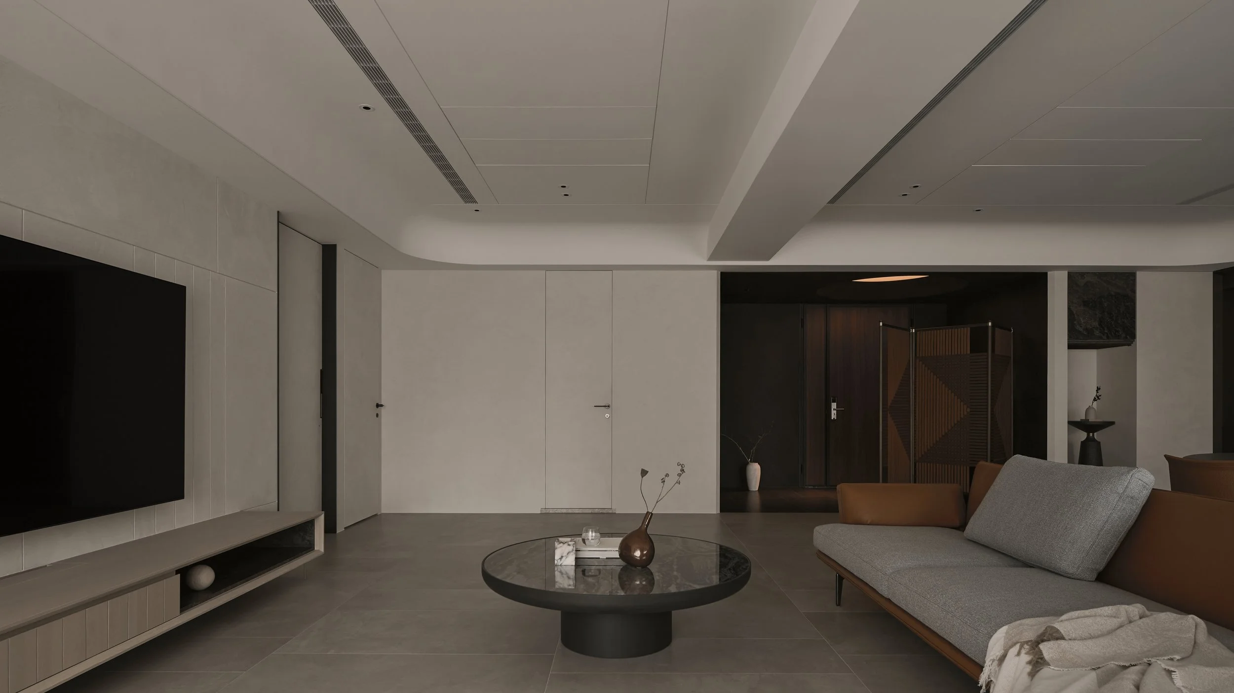
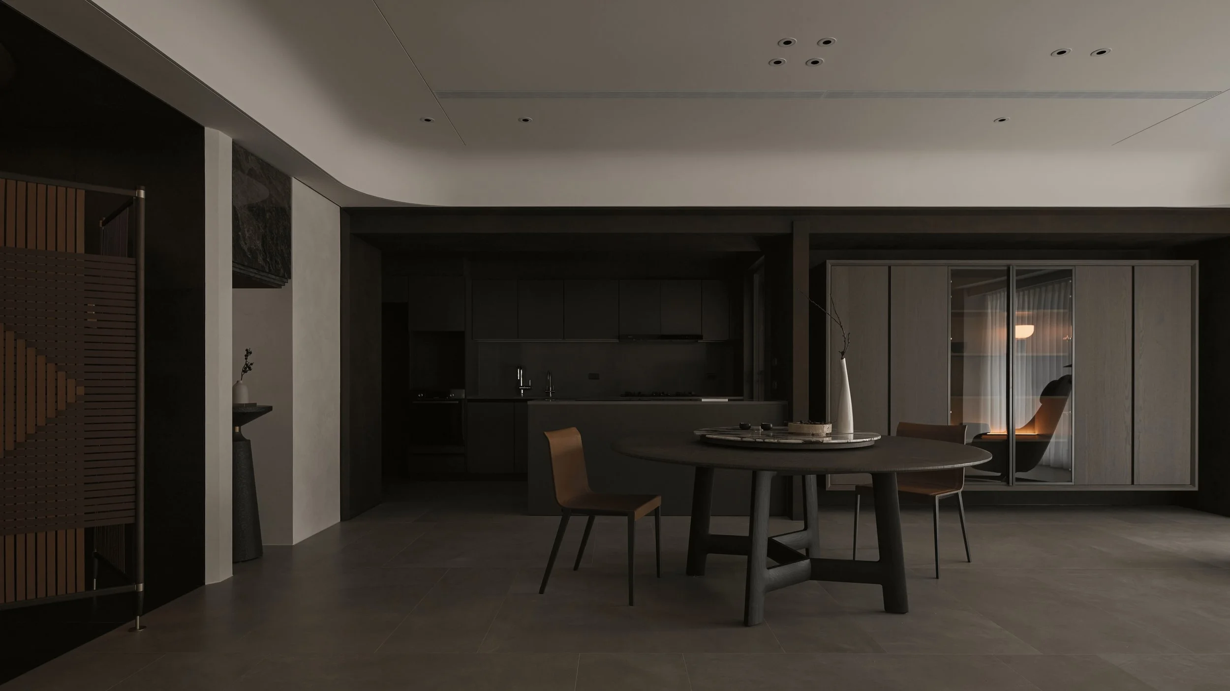
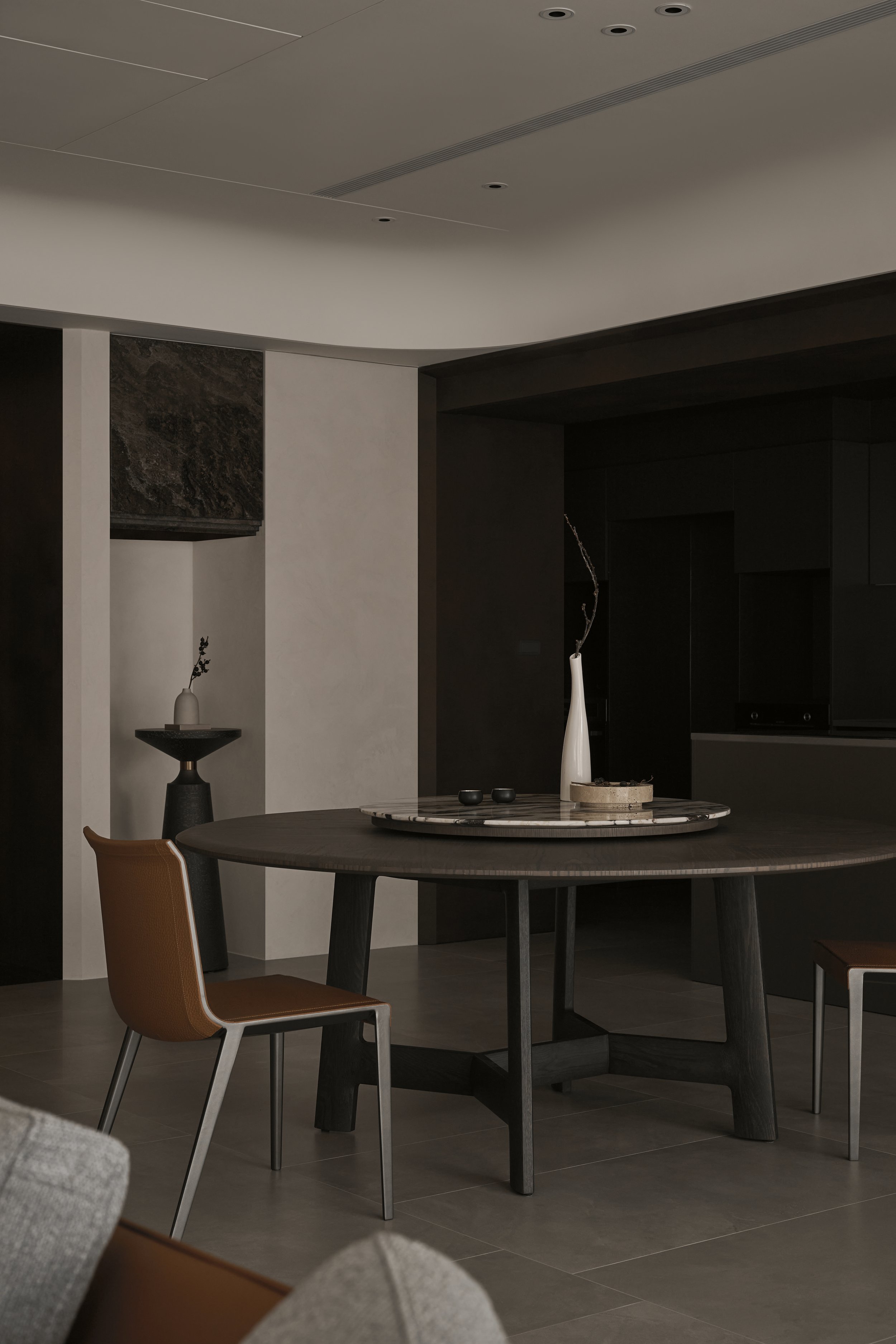
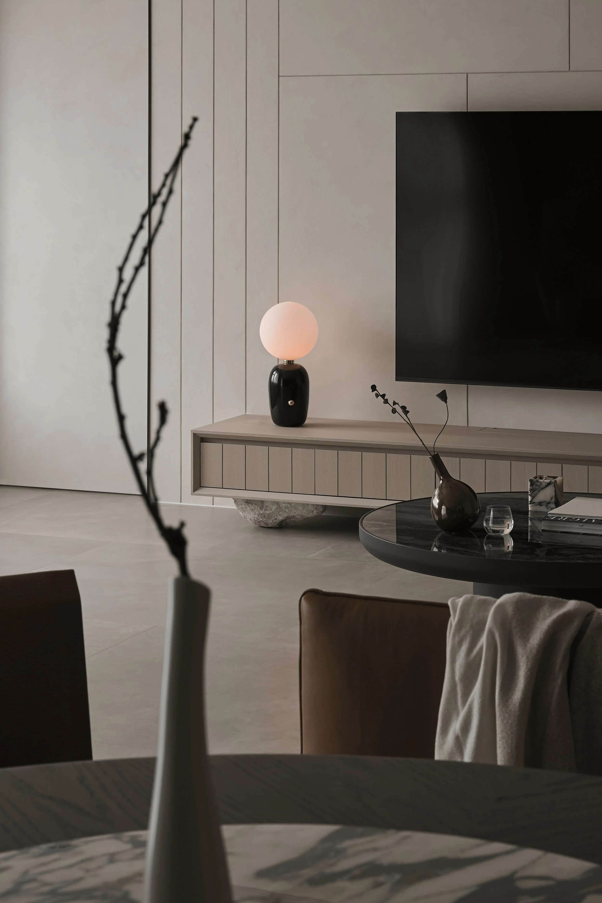
Key components continue the strategy of keeping mass low and boundaries porous. The television console and kitchen storage are conceived as semi-furniture pieces, set within the open plan so that architectural lines remain visible and can extend through the space without being absorbed by millwork. With circulation paths on both sides, movement is distributed rather than channelled, encouraging an easy navigation between zones while maintaining the central clarity of the sightline.
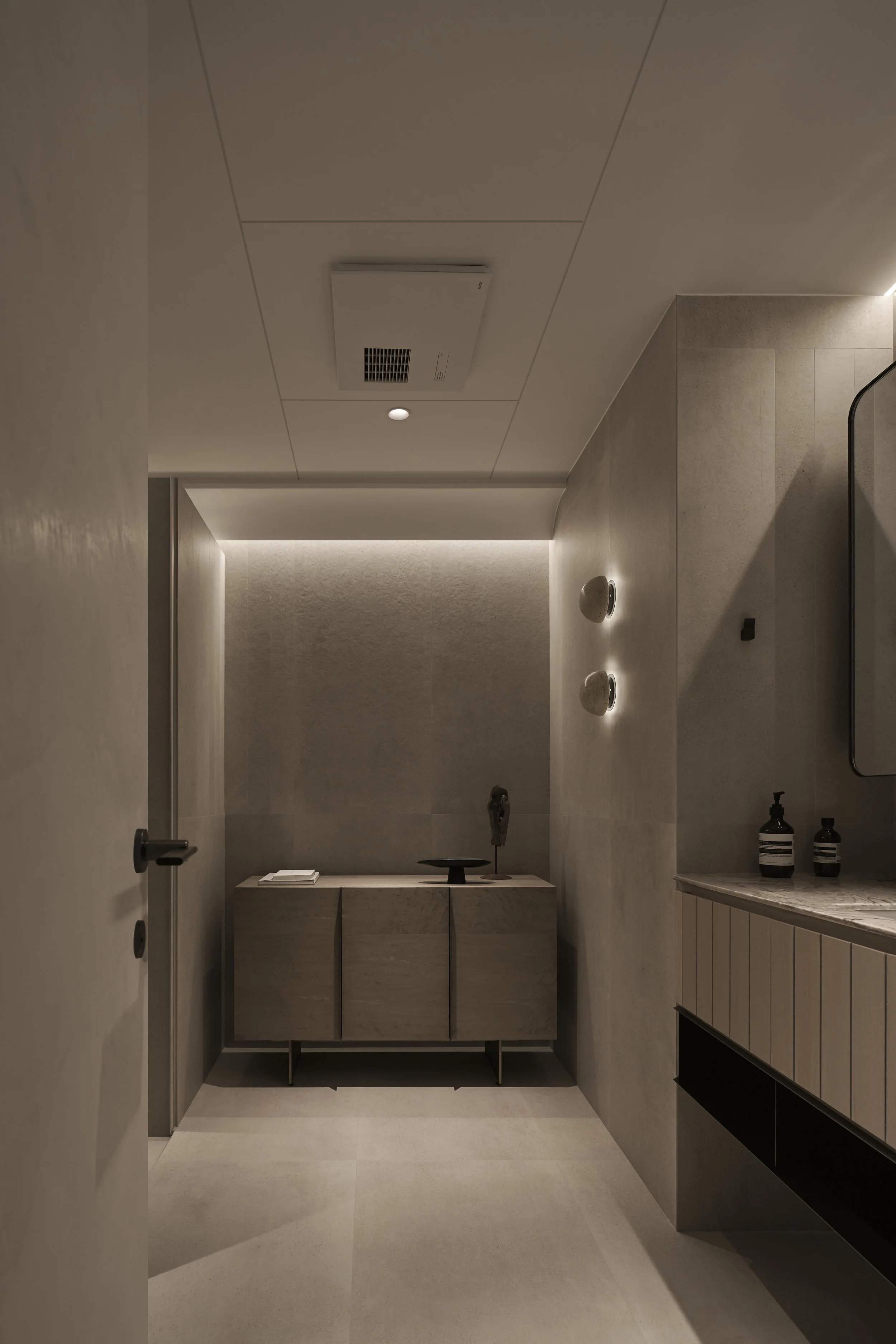
Materiality is pared back to reduce visual interference. White space is treated as a working surface for light, amplified by flush planes, softened curves and open structures that encourage a sense of extension. Instead of relying on sharp textural contrast, depth is carried by proportion and the gradual shift of light and shadow across surfaces throughout the day. Curvilinear ceilings and rounded contours further temper edges, promoting an enveloping softness that blurs where one area ends and another begins. Boundaries become less fixed, more atmospheric.
Within this restraint, tactile moments are concentrated and precise. Raw, natural materials appear in crafted details such as the custom-cut supports to the television unit and the leather weaving of the foyer screen. These interventions offer a grounded, hand-held counterpoint to the otherwise quiet field of white and curve, enriching the interior without adding clutter.
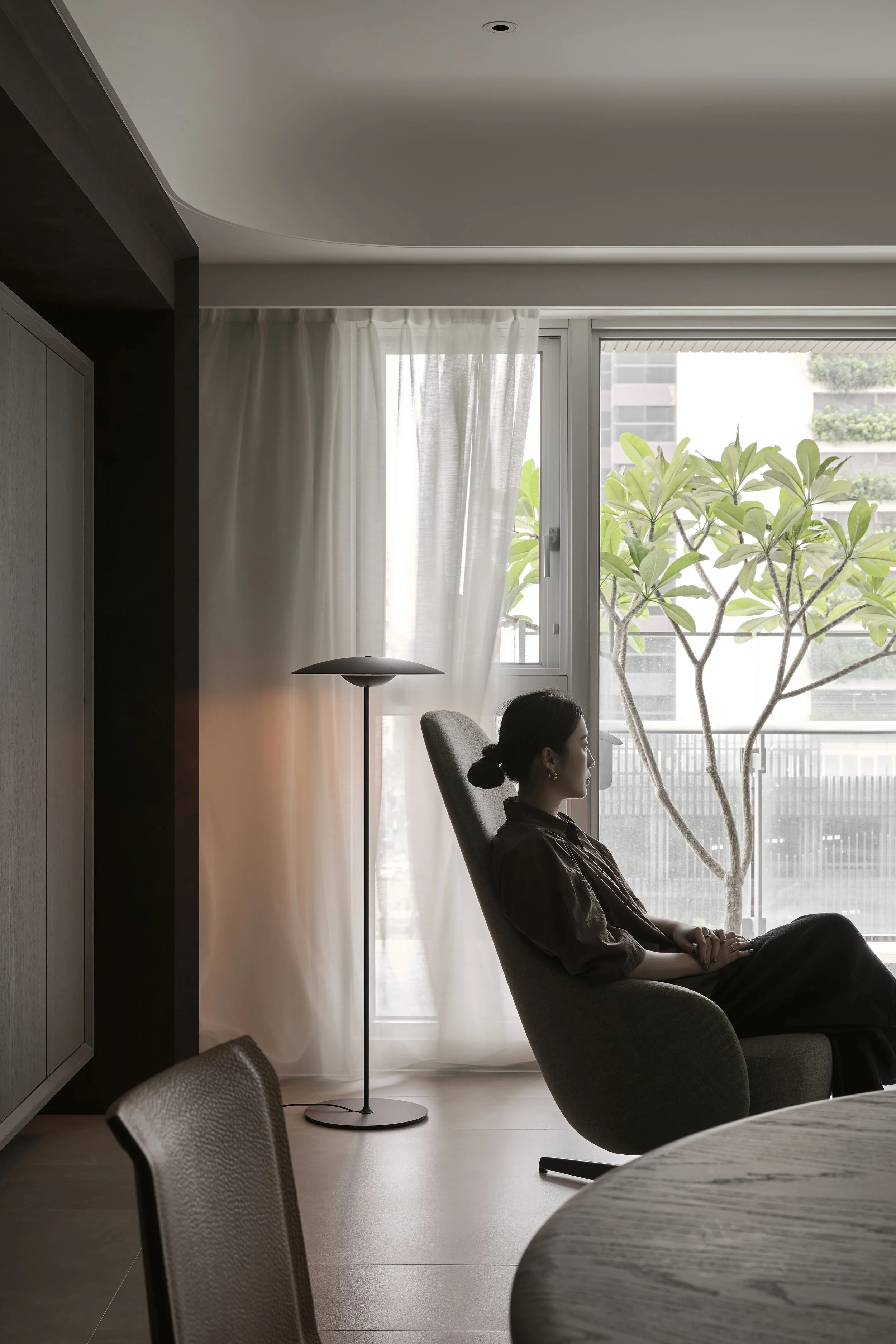
Lighting is composed as a flexible layer rather than a single statement. Dedicated placements for floor, table and wall lamps allow the homeowner to adjust mood intuitively, introducing gentle pools of illumination that sit against the calm backdrop as subtle decorative emphasis. In its totality, Boundary is a vacation home defined by clarity and subtraction: a place where lines remain long, edges remain soft, and space is allowed to feel continuous.